
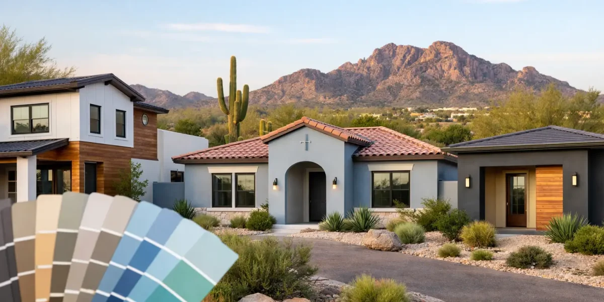
A house can look current or dated before anyone notices the roofline, the landscaping, or the front door. In the Phoenix area, exterior paint color trends matter because color does more than shape curb appeal – it also affects how a home fits the neighborhood, handles intense sunlight, and stays looking clean between washes.
For homeowners and property managers, the smartest color choice is rarely about chasing the newest shade on a sample card. It is about finding a palette that looks polished in desert light, complements stucco and stone, and still feels like the right fit three summers from now. Trends can help, but the best results come from knowing which ones actually work in Arizona.
Exterior paint color trends that are gaining ground
The broad shift is clear: homeowners are moving away from colors that feel overly yellow, peach, or pink, and toward palettes that read cleaner, calmer, and more grounded. That does not mean every home is turning stark white or flat gray. In fact, the strongest exterior paint color trends are more nuanced than that.
Warm whites are one of the biggest examples. Not bright builder white, and not creamy beige from the early 2000s. Today’s warm whites have a soft, sun-friendly look that keeps a home bright without feeling harsh. They pair especially well with black, bronze, or deep charcoal accents on trim, shutters, garage doors, and entry doors.
Greige and taupe are also holding strong, particularly for stucco homes throughout Maricopa County. These shades sit comfortably between gray and beige, which makes them versatile in neighborhoods where roofing, stonework, and paving all introduce different undertones. A good greige can feel updated without looking trendy for trend’s sake.
Earthy desert neutrals are another clear favorite. Think muted sand, clay, mushroom, and weathered stone tones. These colors make sense locally because they reflect the natural landscape instead of fighting it. They also tend to age well visually in strong sun, where cooler colors can sometimes read flatter or more severe than expected.
Soft green-grays and dusty olive accents are appearing more often too, usually on doors, shutters, or body color in the right architectural setting. They bring personality without overwhelming the exterior. Used carefully, they can make a home feel custom rather than standard.
Why Arizona changes the color conversation
A paint color that looks balanced in a catalog or on a house in the Midwest can look completely different under Phoenix sun. That is one reason national trends only go so far here. Desert light is intense, reflective, and unforgiving to undertones.
Whites can become glaring if they are too bright. Grays can shift blue and feel cold against warm stone or tan roofing. Beiges that seemed safe in the sample stage can turn muddy or overly yellow once they are spread across a large stucco wall. This is where experience matters.
Heat and dust also play a role. Very dark body colors can make a bold statement, but they show fading faster and absorb more heat. Very light finishes may brighten a property beautifully, but they can reveal dirt, splash marks, and irrigation stains more quickly in some settings. There is always a balance between appearance, maintenance, and long-term performance.
The most reliable color families for curb appeal
Warm whites and off-whites
These are popular for good reason. They create a clean, updated look and work across many home styles, from modern desert homes to more traditional suburban exteriors. The key is choosing a white with enough warmth to soften the effect in full sun.
For many homes, a warm white body with darker trim and a contrasting front door creates a crisp finish without feeling stark. This palette also gives homeowners flexibility if they want to update lighting, landscaping, or accent features later.
Greige, taupe, and stone
If there is a safest lane in exterior paint color trends, this is probably it. These shades are dependable because they bridge warm and cool elements well. They pair nicely with brown roof tile, black metal, natural wood tones, and manufactured stone.
They also tend to support resale appeal. Not because they are boring, but because they feel intentional and broadly attractive. For homeowners who want an updated look without taking a design risk, these colors are often the right call.
Earth-based browns and clay-inspired neutrals
These colors feel especially appropriate in the Southwest. They can add warmth and richness without drifting into the orange-heavy palettes that have fallen out of favor. On the right home, a muted clay or desert tan can look timeless.
This category works best when the color is restrained. If it becomes too saturated, it can start to compete with the roof, hardscape, and surrounding landscape instead of tying them together.
Charcoal and dark accents
Dark exteriors have had a strong run nationally, and they still have a place here, but usually as accents rather than full-body color. Charcoal garage doors, fascia, shutters, ironwork, and front doors can sharpen the entire exterior. They add contrast and help lighter body colors feel more finished.
On some contemporary homes, a darker field color can work beautifully. Still, it depends on the architecture, the product used, and the amount of direct sun exposure. A dramatic look has to be weighed against fading and maintenance expectations.
Trends that look good online but can be risky in real life
Some exterior paint color trends get attention because they photograph well, not because they perform well on actual homes in Arizona neighborhoods. Pure bright white is one example. It can look sharp in edited photos, but in intense sunlight it often reads too stark and can wash out architectural detail.
Cool slate grays are another. They can be attractive on the right elevation, but they often clash with warmer roofing materials and desert stone. The result can feel disconnected rather than refined.
Highly saturated blues, greens, or black body colors can also be tricky. They may suit certain custom homes, but on many suburban properties they can look out of place or become harder to maintain over time. Trend-forward does not always mean neighborhood-friendly, HOA-friendly, or practical.
How to choose a trend that will still work in five years
The best approach is to treat trends as direction, not rules. If a color family is gaining popularity, ask why. Is it because it complements current architecture? Because it handles sun well? Because it blends with common roofing and masonry? Those are stronger reasons than simple novelty.
Start with the fixed elements you cannot easily change. Roof tile, stone veneer, pavers, concrete, and even neighboring homes all affect how a paint color will read. Once those are accounted for, trend-based choices become much easier.
It also helps to think in terms of a full palette rather than one color. Body color, trim, fascia, garage door, front door, and accent features should all work together. Many color disappointments come from choosing a good main color without considering the entire exterior composition.
Testing is essential. Large sample areas viewed in morning, midday, and late afternoon light will tell you far more than a small swatch. On stucco especially, texture can shift how a color appears, making it seem lighter, darker, or dustier than expected.
Exterior paint color trends for commercial properties
Commercial buildings, offices, retail centers, and hospitality properties often follow a slightly different path. Here, color has to support brand image while still looking professional and easy to maintain. Neutral foundations remain the most dependable choice, usually with stronger accent colors used selectively around entries, trim lines, or architectural features.
In the Phoenix market, commercial exteriors are trending toward cleaner palettes with more contrast and less visual clutter. Warm grays, off-whites, and grounded beige tones help properties look updated without creating maintenance headaches. For business owners and property managers, that balance matters. A color scheme should look sharp on day one and still present well after months of sun, dust, and regular traffic.
Where professional guidance makes the biggest difference
Choosing paint colors is only part of the job. Surface condition, prep quality, product selection, and application all influence how the final color performs and how long it lasts. A great color can still disappoint if the finish is uneven, the substrate is not properly prepared, or the wrong paint is used for the surface.
That is why experienced painters do more than apply paint. They help clients narrow down realistic options, account for lighting and material undertones, and build a palette that works for the property as a whole. For many homeowners, that guidance prevents expensive second-guessing.
In a market like ours, local experience counts. What looks right in Scottsdale may need a different approach in Anthem or Glendale depending on neighborhood style, lot orientation, and the age of the home. Right Choice Painting works with that reality every day, helping clients choose colors that feel current, fit the property, and hold up in Arizona conditions.
Trends will keep changing, but a well-chosen exterior color should always do the same job: make your property look cared for, well-finished, and right at home in its surroundings.