
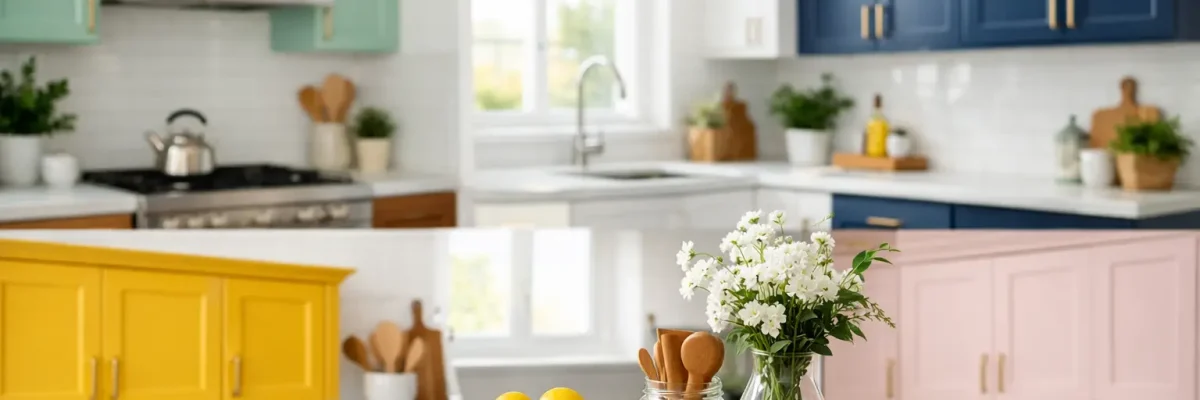
A cabinet repaint can change the entire feel of a kitchen without the cost, downtime, and disruption of a full remodel. The best cabinet color ideas for a kitchen do more than follow a trend. They work with the room’s natural light, countertops, flooring, backsplash, and the way your household uses the space every day.
For Phoenix-area homeowners, color selection also has a local consideration: our bright desert light can make undertones look stronger than they did on a small paint chip. A shade that appears soft and neutral in a showroom may read yellow, blue, or gray once it is painted across a full run of cabinets. Testing samples in the actual kitchen and pairing the right color with professional surface preparation makes all the difference.
Start With the Fixed Finishes
Cabinets may be the largest painted surface in the kitchen, but they are not the only surface that matters. Before choosing a color, look closely at the elements you plan to keep: countertops, backsplash tile, flooring, wall color, and hardware. Their undertones should guide the decision.
For example, creamy travertine, warm oak flooring, and brass hardware tend to favor warm whites, putty shades, mushroom taupes, and muted greens. Cool gray quartz, white subway tile, and polished nickel can support crisp whites, blue-grays, charcoal, or navy. A cabinet color does not need to match every finish, but it should make the room feel intentional rather than pieced together.
Paint large sample boards, then move them around the kitchen during morning, afternoon, and evening light. This simple step prevents a costly surprise after the doors are finished.
Cabinet Color Ideas for Kitchen Updates
1. Warm White for a Clean, Welcoming Look
Warm white cabinets remain a dependable choice because they brighten the room while still feeling comfortable. Unlike stark, cool white, a warm white has a subtle cream, beige, or soft yellow undertone that works especially well with desert-inspired neutrals, natural stone, and wood-look floors.
This is a strong option for kitchens with limited natural light or compact layouts. The trade-off is maintenance: bright finishes show cooking splatter, fingerprints, and scuffs more readily than mid-tone colors. A durable, washable cabinet coating helps the finish hold up to daily use.
2. Soft Greige for Flexible Style
Greige sits between gray and beige, giving homeowners a versatile neutral that can feel warm or modern depending on the surrounding materials. It is a practical choice when a kitchen has mixed finishes or when homeowners want a fresh update without committing to a bold color.
Choose a warmer greige when countertops have tan, cream, or gold veining. A cooler version may work better with white quartz and stainless steel appliances. Greige also tends to hide everyday marks better than pure white, making it a sensible choice for busy family kitchens.
3. Classic Navy for Depth and Contrast
Navy cabinets bring structure and confidence to a kitchen. The color looks especially sharp on a large island, a lower cabinet run, or cabinets paired with white walls and light countertops. In a larger kitchen with good daylight, navy can create a polished, high-end result without feeling overly formal.
Dark cabinets absorb light, so this is not always the right choice for a small, enclosed kitchen. If you like the look but need more brightness, consider navy lower cabinets with white or warm neutral uppers. This two-tone approach adds depth while keeping the room open.
4. Muted Sage Green for a Relaxed, Updated Space
Sage green has staying power because it feels calm, natural, and easy to live with. It complements white quartz, warm brass, black hardware, light oak, and many of the organic finishes homeowners are choosing for updated kitchens.
The key is restraint. A muted sage with gray or earthy undertones typically looks more refined than a bright, yellow-green shade. In homes with strong Arizona sunlight, test this color carefully. Intense light can pull out yellow undertones and make the final result look much warmer than expected.
5. Deep Green for a Tailored Finish
For homeowners who want more drama than sage provides, deep green can be an excellent cabinet color. Forest, olive, and charcoal-green shades create a grounded, tailored appearance, particularly with warm wood accents and unlacquered brass or matte black hardware.
This color is best used in kitchens with enough natural light, pale counters, or a light backsplash to balance it. It can also work beautifully on an island while the perimeter cabinets remain neutral. That approach gives the room personality without making the entire kitchen feel dark.
6. Charcoal or Soft Black for Modern Definition
Black cabinetry is no longer limited to ultra-modern homes. Softer black and charcoal tones can look sophisticated in transitional, contemporary, and even traditional kitchens. They pair well with natural wood, white stone, and metal finishes, creating a crisp contrast that makes hardware stand out.
Still, black is not forgiving of poor preparation or inconsistent sheen. Cabinet doors need proper cleaning, sanding, repairs, priming, and professional application for a smooth finish. It also shows dust and light-colored residue more easily, so it works best for homeowners comfortable with regular wiping and upkeep.
7. Natural Wood and Painted Cabinets Together
Not every kitchen needs every cabinet painted the same color. Combining painted perimeter cabinets with a natural wood island or open shelving creates dimension without relying on a bold paint color. Light oak, walnut, and other wood finishes add warmth that balances white, greige, green, and charcoal cabinets.
This option can be particularly useful in open-concept homes where the kitchen needs to connect naturally with nearby living spaces. Keep the wood tone consistent with or complementary to the flooring so the mix feels planned rather than accidental.
8. Dusty Blue for a Softer Alternative to Navy
Dusty blue brings color into the kitchen with less visual weight than navy. Blue-gray cabinets can feel fresh alongside white counters and brushed nickel, while a slightly warmer, muted blue works well with brass and natural wood.
Avoid highly saturated blues unless the kitchen has a design style that supports them. In most homes, a quiet blue with gray undertones will remain appealing longer and give future buyers a more approachable palette.
9. Mushroom Taupe for Warm, Understated Elegance
Mushroom taupe is a mid-tone neutral that gives a kitchen more depth than white while avoiding the heaviness of dark cabinetry. It works well with warm white walls, creamy stone, bronze hardware, and both light and medium wood floors.
This is a strong choice for homeowners who want a tailored finish that will not feel tied to a short-lived trend. Because it falls in the middle of the value range, it is also more forgiving of everyday wear than very light or very dark paint colors.
10. Two-Tone Cabinets for a Custom Look
Two-tone kitchens are most successful when the color division has a clear purpose. A common formula is darker lower cabinets and lighter uppers, which grounds the room while preserving brightness at eye level. Another effective approach is neutral perimeter cabinets with a colored island.
Limit the palette to two cabinet colors, then repeat one or both colors elsewhere through bar stools, window treatments, or accessories. Too many competing finishes can make even a newly refinished kitchen feel busy.
Color Is Only Part of a Durable Cabinet Finish
A beautiful color cannot overcome poor adhesion, visible brush marks, or chipped edges. Cabinet refinishing requires more than applying paint to doors. Grease and contaminants must be removed, damaged areas repaired, surfaces properly sanded, and the right primer and coating system selected for the existing material.
Cabinets also need to be removed or carefully masked, labeled, and reinstalled with precise alignment. Professional application methods help produce an even finish, while thorough cleanup and a final walkthrough ensure the doors, drawers, and hardware function as they should. Right Choice Painting approaches cabinet refinishing with that level of preparation because the details are what protect the finished result.
When comparing samples, do not choose only from a trend board. Choose the color that suits your home’s light, fixed finishes, and daily routine. The right cabinet color should still feel like the right choice when the kitchen is busy on a weekday morning, not just when it is freshly cleaned for a photo.